
The first page looked terrible. I had _no_ idea what to click. I opened it, thought it was a blog post and closed it.
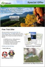
The second one is much better. Only thing is you should prob take out the "need a CC" line, or make it far less prominent. Also, I didn't really wanna read all the features. You should highlight/bold some of the best features or certain words in the description.
But this second page is much better. GJ. Some things I'd advise (but I'm a newb) is to make the area around the middle of the page.. prettier. Search google for your keywords and see what others are using for their LP.
Maybe have an image BG, like sky or grass like the offer page. It shouldn't be prominent, but should be pleasing on the eyes.. The orange color doesn't go with anything in the middle.
peace


")
