Some practice with Wordpress designs

gtaforever00

New member
Oct 15, 2012
29
0
0
The woods of TN
Ok so I have been lurking around here trying to figure out the basics of IM. I believe I am going to start with the basics of designing a web page first. I want to make a couple of practice sites first and get a feel of everything before I really get my feet wet. I want to get some opinions and reviews from others so I can apply it to my first project. I want you all to be completely honest with no bullshit. *I know go ahead and say it*

I will be picking a clickbank offer for my first attempt. With my second attempt, I want to try reviewing a few amazon products and have links to buy the product. Hopefully I will not be the only person learning from this thread!


I have not asked anything yet. I am in the process of building a practice site using a clickbank offer. Maybe I could ask something though. If you were making a site would you make a home page and a landing page for the offer? If you did make a homepage, what would you have on it? (ex. reviews, guides, descriptions, etc.)
 
I have not asked anything yet. I am in the process of building a practice site using a clickbank offer. Maybe I could ask something though. If you were making a site would you make a home page and a landing page for the offer? If you did make a homepage, what would you have on it? (ex. reviews, guides, descriptions, etc.)
^ this plus:

  • testimonials
  • GOOD product pictures
  • videos! (google rewards them and will increase to do so in the future)
  • Secure site badgets (trust icons)
  • a GOOD about page (think, what would be good to increase sales/built trust in the viewers), don't try to convince everybody how big your dick is,
  • a lot of things wrong in the About me section, I found this page helpful:Are You Making These 7 Mistakes with Your About Page? | Copyblogger
In the end you don't try to win a design contest with your site. Your main goal should be to make dough with it.
Google your keywords and look at other

sites in your niche.

Copy them and put a twist on it.
 
Thanks for the advice Maxamillion. I need to start thinking simple is the key. I tend to over complicate things at times.

I have chosen my niche on this project to be Background Checks. This is something I am not doing as a real project. Any info is fake and there is no real site.

Ok so I had a little time at work to throw something together. I work a lot of hours at my day job, so I have very little time to really work on this. The important thing is I am making progress.

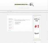
I have attached a picture of the homepage as it sits current. Is the design too simple? I know it needs more content which I will try and work on this some tonight. Am I going in the right direction? If anybody wants to add anything please do!

I have researched some basic questions/phrases to ask when researching.

  • Who
  • What
  • Where
  • When
  • Why
  • How
This has helped me jump start some research on my niche. Ask yourself those questions and if an idea does not pop up in your head then maybe you need to try something else.
 

Attachments

  • home_sample.jpg
    home_sample.jpg
    83 KB · Views: 19
Dude you just probably used every combination of font family and style there is on that lander. SO MANY FONTS. Less is more.
 
^ this plus:

  • testimonials
  • GOOD product pictures
  • videos! (google rewards them and will increase to do so in the future)
  • Secure site badgets (trust icons)
  • a GOOD about page (think, what would be good to increase sales/built trust in the viewers), don't try to convince everybody how big your dick is,
  • a lot of things wrong in the About me section, I found this page helpful:Are You Making These 7 Mistakes with Your About Page? | Copyblogger
In the end you don't try to win a design contest with your site. Your main goal should be to make dough with it.
Google your keywords and look at other

sites in your niche.

Copy them and put a twist on it.

Thanks Maxamillion for the advice on the content.

Dude you just probably used every combination of font family and style there is on that lander. SO MANY FONTS. Less is more.

Thanks Houdas for the advice on the style.

I guess it needs to be simple with just the right information included. I am currently working on the page now to fix the font issue and to add some more content to the landing page. Would anyone say I am heading in the right direction?
 
Looks alright so far. Some tips, make sure to commit with a colour pallet, make your "Order Now" button look more appealing, and for your landing page, make the image mean something to the user. When I looked at it, the image had nothing of interest to me. Just a waste of space currently.
 
Looks alright so far. Some tips, make sure to commit with a colour pallet, make your "Order Now" button look more appealing, and for your landing page, make the image mean something to the user. When I looked at it, the image had nothing of interest to me. Just a waste of space currently.

Thanks knownerror for the tips!

When you say color pallet, do you mean only having a certain few colors for the theme of the website? How many colors would you advise? I know they need to be contrasting to catch people's eye. My site is kind of bland the more I look at it.